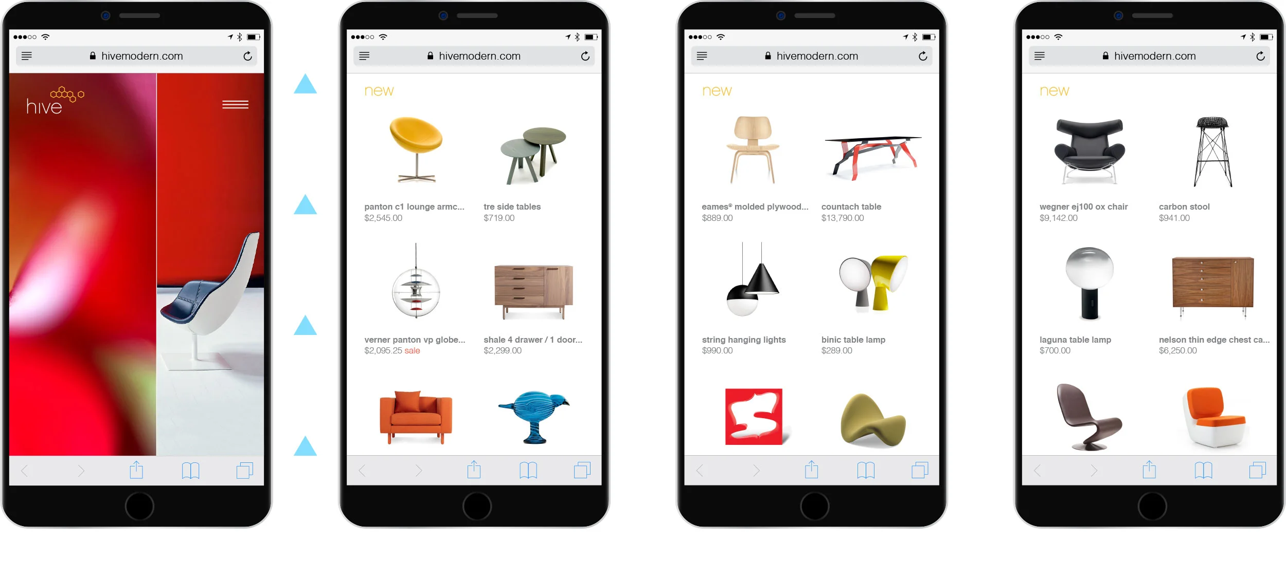
Hive Mobile

Hive Modern
Responsive website design for mid-century retail giant


Brand first
Home cycles through flexible floral and product diptychs, with events, additional featured products, and global elements below the fold.


Navigation
Main navigation accordion menu includes search, parent categories, categories, and utility content.


secondary nav
Page category navigation and sort menu


Product Images
Product image gallery, full screen and zoom views


Fabric Selector
The fabric selector provides access to thousands of swatches. Users easily select their options and then check out.


About Hive
Simple and flexible design accommodates company pages and navigation.

This was a dream to work on, especially for a Mid-Century design nerd and graphic designer like myself.
